Tuesday 29 June 2010

Poster designs for our music video

In our group, we decided we wanted our posters to clearly link with our video ideas, so Hannah produced these designs for posters on the Coral Draw programme. They both feature the same image of the daisy, which references to the sixties flower power genre, although the typograhy has been placed and obscured to create different effects. The font for the title of the song 'sha la la la lee' looks to be the same as 60's font that was used furing the time which connotes the hippy style. Out of the two i prefer the poster at the bottom due to the fact that you can see the stem of the daisy although i like the layout of the font on the first poster because it places more emphasis on the music title and it is clear to see.


Typography

For our music video poster, we have to look for a font that coincides with the sixties style of the video, and i think this one works very well as it looks like the font from the 60's era.


This font is quite simplistic and i dont think it would make the poster look different from any others but in terms of music poster conventions, simple font is generally used due to the fact it is giving information which is supposed to be clear to understand and read.


This font is quite similar to the one above as they both include flowers
which is important and something we would want to show on the poster.


Poster analysis - Florence and the Machine


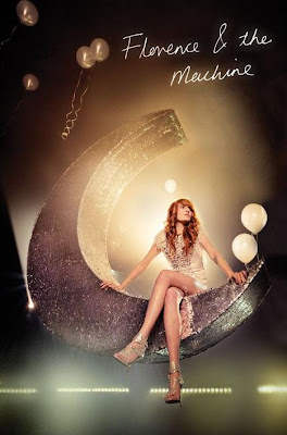
This is the poster for Florence and the Machine's song 'You've got the love'. It shows Florence to be sitting on a cresent sparkly moon which also features in her video for the song You've got the Love. I think this poster represents Florences' music very well as it contains the fairytale and whimsical like elements that her songs have.
Compared to the poster for that of the Moldy Peaches, this poster looks like it would have cost quite alot of
money to produce and looks as if it has been carefully staged to give a better aesthetic effect. The font appears to look like it has been written in lights, and the colour scheme all matches and coincides well, even with the costume and hair of Florence herself.
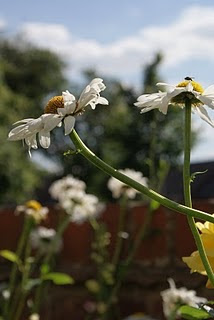
Poster analysis


This poster is of the Indie band Moldy peaches for their album of the same name released in 2001 and again in 2008 after featuring in the hit film Juno. This poster is simple as it is in black and white and shows clearly people who look to be in the band. There is a Japanese style to this poster due to the lines which are placed in different directions and the head band of one of the band members. I like the simplicity of the poster however i feel it could be more colourful, although it links with their songs from the album very well as they too sound quite simple with the minimal instruments. In terms of typography, i think the difference in the fonts adds more to the somewhat plain cover.

Monday 28 June 2010


This is the song for our music video which we pitched our ideas for.

1960's hippie era

Our music video will be based around the 1960's hippie era which is around the time in which the song ; 'sha la la la lee' was recorded. The hippie subculture was originally a youth movement that arose in the United States during the mid-1960s, swiftly spreading to other countries around the world. The etymology of the term 'hippie' is from hipster, and was initially used to describe beatniks who had moved into New York City's Greenwich Village and San Francisco's Height. Hippies sought to free themselves from societal restrictions, choose their own way, and find new meaning in life. One expression of hippie independence from societal norms was found in their standard of dress and grooming, which made hippies instantly recognizable to one another, and served as a visual symbol of their respect for individual rights. Through their appearance, hippies declared their willingness to question authority, and distanced themselves from the "straight" and "square" (i.e., conformist) segments of society.

Although we want our music video to contain elements of the hippy era, we don't want it to overpower the song or the modern and contemporary feel we want to include. We would like it to look like a video that has been made in 2010 but that still incorporates the conventions of 60's music.

Thursday 24 June 2010

This is a test of our green screen knowledge where we used a member of our class so we could then try out using the backgrounds that come with green screen. We thought for exaggerated effect we would use a beach scene which worked out quite well.

Wednesday 23 June 2010

More photos


These are just a few more pictures that i took to represent the hippy and summery feel we want the music video to have. I have taken the pictures from various angles to provide a wider range of perspectives in order to get the best picture.

Photos for Planning


I took these pictures in order to convey the theme and ideas of how we want our video to look. Obviously these are just pictures we will use for planning and as a basis for the music video. They show a group of friends sat around in a circle looking as if their having a laugh and a general good time, something else we want to convey in the video. The pictures are taken as almost point of view shots, the last 2 more so than the others, however i think this doesn't work as well as the head on shots because the kind of 'lurking' shots look sort of secretive and don't really have the summer time party effect we wanted to create. Some shots were thinking of using are;
  • high angle shots-which will give a wider view of the summery scene we want to show.
  • Close-ups of props we are considering using such as 60's bowler hats etc.
  • Zoom in shots - to show various people lip syncing and holding up boards or pieces of card showing the title of the song 'Sha la la la la lee'.


Tuesday 22 June 2010

The Small Faces


For our music video, we were given the choice of six songs to choose from, and in our group we decided we wanted to create a video for the song 'Sha la la la la lee' by the 60's group, The Small Faces. This group was an English rock band from London and today they are remembered as the most acclaimed and influential mod groups of the 1960's. They are also acknowledged as being one of the biggest original influences on the Britpop movement of the 90's. As a group we had never heard of the song, therefore we had never seen the video, in effect letting us come up with our own and original ideas for a music video.


These are some pictures Hannah took for ideas for our storyboard and overall theme of the music video we are going to produce. The daisies represent the summer time and hippy theme we want to create as we feel that the song we have been given links with this particularly well.

Wednesday 16 June 2010

A2 Media

After finishing our AS level production piece and exam, we are now starting A2. Before we choose one of the thirteen briefs to do, we have been set the task of producing a short music video of around one minute. In the video, we have to contain the elements of traditional music videos such as that of lip syncing. I am working in the same group i worked with last year due to the fact we worked quite well together last time in terms of generating ideas and getting things done. For our music video we have been assigned a song called 'sha la la la la lee' by the Small Faces, and although it is a song we have not heard of, this makes it easier for coming up with video ideas.

Music Video analysis - Paramore


This music video is of the American Rock band Paramore. 'Brick by Boring Brick' was the second single released from their third album, with a recurring butterfly symbol that is shown on the album cover, poster and also in this video, a reason why i chose to analyse Paramore due to the synergy of their music and promotional products. The video begins in an autumn, almost fairytale landscape in which the overhead shot then slowly moves in, focusing on a young girl. There is an apparent theme to the colours which are dominant in this video as they are in correlation with the poster and album cover, portraying the synergy. The lead singer wears white which coincides with the idea of innocence referencing back to the butterfly which is usually has the connotations of purity and new life. The essence of the band comes through when the video shows one of the band members digging a grave, reinforcing their rock/punk genre.


The young blonde girl who is carrying a doll looks to be a younger representation of the lead singer who also has blonde hair singing off a swing-something which is again seen as childlike showing innocence. Through these shots there are autumn leaves falling. A meduim/close up shot of the butterfly wings on the young girl reminds the audience of the images on the album.


There is the juxtapostion of life and death throughout the video due to the birth of the butterflies and then the dark and sinister digging of a grave, portraying the cycle of life perhaps, relating to the lyrics 'go get the shovel, and we'll dig a deep hole, to bury the castle, bury the castle'.
Low angled shots of a magical world coincide with the fairytale theme that exists in their new albums's merchandise, with elements such as a knight in shining armour and red animated mushrooms. Various special effects have been used to create bright moving lights aswell as cartoon creatures, something which we would have to think about using if we wanted to create a music video for a band of our choice.
It is apparent that the lyrics very much match the images giving more of an understanding to the song and a reason behind the words, a process again we would have to think about. Mid way through the video is a mirror with a detailed frame which links back to the back of the CD cover which shows the different niche frames. The mood of the video changes when effects of thunder and lightning are shown, reinforcing Paramore's genre of music, in effect gaining more a male audience than the previously effeminate scenes of the video. When the girl takes off her wings i think this cleverly connotes the loss of innocence, as throughout there is this subliminal message which has been conveyed very well.
The video ends with the young girl falling down the hole that has been dug, much like that of Alice in Wonderland, however it looks as if the girl is deceased as her doll is thrown into the grave with her and the mud is then thrown back in, connoting that of death, in contrast with the way the video started it ends with a very sinister message.


This is the album cover for Paramore's album 'Brand New Eyes'. It is apparent that the synergy of the symbolic butterfly links the band's promotional merchandise and the video together quite cleverly. Although the use of the butterfly could be considered to be effeminate, the neutral background colour and bold orange contrasted with black don't deter the male audience. The typography 'Brand new Eyes' is in italics which later links to the more elaborate art detail on their poster as it gives a higher quality of aesthetics. The butterfly wings are divided with one slightly placed over the vertical black line and it is believed that the 'Brick by Boring Brick' single lyrics of 'The angles were all wrong / Now she's ripping wings off of butterflies' were inspired by the image of the butterfly. The back of the CD case shows what looks to be varying pictures frames, or mirrors, adding to the niche effect of the images. I think this album packaging works as it is quite simple in terms of the colours used and the one reoccuring image of the butterfly, as its the simplicity that makes the merchandise memorable, something which is hugely effective when it comes to the target audience and consumers of their music.


This is one of the posters of Paramore for their 2009 upcoming album of 'Brand New Eyes'. The colours of the bold orange, black and neutral cream connect the album cover and the music video together along with the poster, making them look more expensive and professional. The poster shows the band with the lead singer's hair matching the orange, and all the band members being portrayed in a black template/stencil image almost. This contrasts with their previous posters promoting the band as it doesnt just focus on their image, but the butterfly emblem, which links with the 'Brick by Boring Brick' single. The information of when their album is released is shown on the poster however it is in keeping with the decorations and detail as it doesn't override or dominate the layout or design.
Websites and music companies' logo's are shown at the bottom of the poster giving it the professional aesthetic which is important when people want to buy their album.