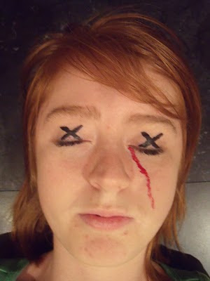
The magazine cover idea was inspired by a close up picture of joanna, who also features as one of the 'victims' in our teaser trailer. We wanted the cover to look or be reminiscent of other magazine covers advertising a film or trailer. From research, i have found that covers for films such as Sherlock Holmes, Star Trek and Harry Potter have close up or meduim shots of the film's main character/ protagonist. The close up shot shows two black x's drawn on jo's eyelid's to represent death - which coincides with the 'presummed dead' title. We then used acrylic paint to create what looks like blood falling down from the eye, reinstating the horror genre of our teaser trailer piece.
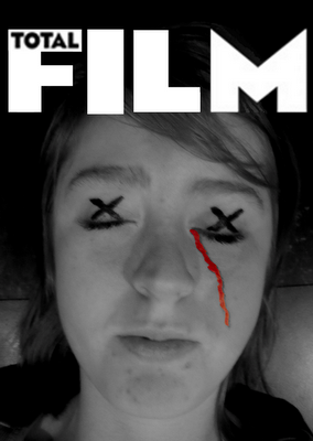
Above, we then used programmes such as photo shop and coral draw to create the title of the magazine cover - which is taken from the actual magazine 'Total Film'. We decided to use this title as it goes really well with the black and white version of the magazine and it was also inspired by the Total Film cover for Star Trek, in which it had actor Chris Pine's face staring straight at the audience. The black and white works really well as it makes the red 'blood' stand out and makes it look more striking which may entice the audience to read it.
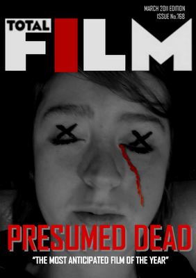
Finally, the red, which is a typical convention of the horror genre, is placed over the 'I' letter. This means the cover has own own little twist on it, with the bold typography of the teaser trailer title also being shown in red. The tagline 'the most anticipated film of the year' hopefully makes readers want to invest in the magazine which would ultimatley help promote the teaser trailer for the film. To further the magazine cover, we need to include a few more titles of what else is included in the magazine, to make it look more aesthetically realistic and professional.
 The magazine cover idea was inspired by a close up picture of joanna, who also features as one of the 'victims' in our teaser trailer. We wanted the cover to look or be reminiscent of other magazine covers advertising a film or trailer. From research, i have found that covers for films such as Sherlock Holmes, Star Trek and Harry Potter have close up or meduim shots of the film's main character/ protagonist. The close up shot shows two black x's drawn on jo's eyelid's to represent death - which coincides with the 'presummed dead' title. We then used acrylic paint to create what looks like blood falling down from the eye, reinstating the horror genre of our teaser trailer piece.
  Above, we then used programmes such as photo shop and coral draw to create the title of the magazine cover - which is taken from the actual magazine 'Total Film'. We decided to use this title as it goes really well with the black and white version of the magazine and it was also inspired by the Total Film cover for Star Trek, in which it had actor Chris Pine's face staring straight at the audience. The black and white works really well as it makes the red 'blood' stand out and makes it look more striking which may entice the audience to read it.
  Finally, the red, which is a typical convention of the horror genre, is placed over the 'I' letter. This means the cover has own own little twist on it, with the bold typography of the teaser trailer title also being shown in red. The tagline 'the most anticipated film of the year' hopefully makes readers want to invest in the magazine which would ultimatley help promote the teaser trailer for the film. To further the magazine cover, we need to include a few more titles of what else is included in the magazine, to make it look more aesthetically realistic and professional.


 the 2004 remake of the japanese film Ju-On, named now, The Grudge. I think perhaps even if people of our generation and an audience of our age haven't seen the actual film, the image will be reminiscent of them for the American psychological horror. The red '2' in the middle of the child's eye is connoting that this poster is advertising The Grudge 2, a sequal to the previous film, which already has a base target audience, in effect this poster is hoping for the same type of audience to see this film. The black, white and red all connote that of horror conventions which again automatically suggest the genre of the poster, with these colours generally occuring within posters such as these. The wide eye of the child is also an image reminiscent of such films as Psycho and Scream, where main characters on the front of posters and dvd's etc are seen to have alert eyes connoting that they have perhaps witnessed a horror.