Friday 15 April 2011
Saturday 2 April 2011
Other videos
I have various other videos which show some audience research, poster analysis and the type of music we have used etc however they will be on my blog shortly - but they can be seen on my media partners blog.
Friday 1 April 2011
Final Poster
 This is our final version for our poster in which it would be used to advertise our teaser trailer. After observing the 4 different versions of the initial idea for the poster, we decided to use this one as it had the better aesthetic effect. The red tagline 'nothing's certain..not even death' was added as we thought it would be a good touch to the poster as it is conventional of film advertisements as part of the distribution.
Final Magazine Cover

Thi is our final version of our magazine cover, which looks considerably better in terms of quality than it did previously. The red colour is a continuous theme throught the poster, teaser trailer and now the magazine cover. We wanted the cover to look as realistic as possible so we put in subheadings advertising other stories and reviews within the magazine.
Magazine cover analysis
This video shows feedback we received when showing our target audiences our magazine cover for our teaser trailer.
Magazine Cover Progression
This video shows the progressing versions of our media magazine cover which advertises the teaser trailer and film for 'presumed dead'.
Tuesday 22 March 2011
Process of magazine cover
 The magazine cover idea was inspired by a close up picture of joanna, who also features as one of the 'victims' in our teaser trailer. We wanted the cover to look or be reminiscent of other magazine covers advertising a film or trailer. From research, i have found that covers for films such as Sherlock Holmes, Star Trek and Harry Potter have close up or meduim shots of the film's main character/ protagonist. The close up shot shows two black x's drawn on jo's eyelid's to represent death - which coincides with the 'presummed dead' title. We then used acrylic paint to create what looks like blood falling down from the eye, reinstating the horror genre of our teaser trailer piece.
  Above, we then used programmes such as photo shop and coral draw to create the title of the magazine cover - which is taken from the actual magazine 'Total Film'. We decided to use this title as it goes really well with the black and white version of the magazine and it was also inspired by the Total Film cover for Star Trek, in which it had actor Chris Pine's face staring straight at the audience. The black and white works really well as it makes the red 'blood' stand out and makes it look more striking which may entice the audience to read it.
  Finally, the red, which is a typical convention of the horror genre, is placed over the 'I' letter. This means the cover has own own little twist on it, with the bold typography of the teaser trailer title also being shown in red. The tagline 'the most anticipated film of the year' hopefully makes readers want to invest in the magazine which would ultimatley help promote the teaser trailer for the film. To further the magazine cover, we need to include a few more titles of what else is included in the magazine, to make it look more aesthetically realistic and professional.
 Wednesday 16 March 2011
Poster Possibilities
These are images of what our poster for the teaser trailer could eventually look like, with all these images being reflective of the drawn out version previously shown. All of the pictures show the hand of a 'deceased' person, or so the audience will think, and each contains the name and release date of the film in order to gain the audience's attention.

The image above shows a horizontal view of the hand in which the titles include the people who starred in the film, in an almost typewriter font. I think this is effective as the names stand out due to the poster being black and white however in terms of the view of the hand i think a different angle would have benefitted it, like the other versions of the posters below. The tag is placed above the hand with focus being on this, important for the audience as we want it to catch their attention.
 The poster above is in colour which i think is perhaps less effective than the black and white ones, however i prefer the angle and perspective of the hand and where the typography is placed, and i think the shadows on the black and white posters looks more effective and has a better aesthetic quality.
 This is the same as the poster above yet i think it works better with it being in black and white. The shadow looks more professional and reminiscent of film noir, yet i maybe think that a splash of colour would again benefit the poster as although our teaser trailer isn't the conventional horror genre, i think we at least want some definition of horror in order for this to connote to the audience.
 The last image shows the hand at a different angle which is probably less effective than the others above as not all of the hand can be seen. I like the way in which the tag has been placed and the typography on it as it is a bit more bold than the others and clearer. The shadow is darker which could have sinister connotations which ultimately help promote the horror genre. Although i dont prefer the way the titles of the characters names have been shown as there is less emphasis on them.
The image above shows a horizontal view of the hand in which the titles include the people who starred in the film, in an almost typewriter font. I think this is effective as the names stand out due to the poster being black and white however in terms of the view of the hand i think a different angle would have benefitted it, like the other versions of the posters below. The tag is placed above the hand with focus being on this, important for the audience as we want it to catch their attention.
 The poster above is in colour which i think is perhaps less effective than the black and white ones, however i prefer the angle and perspective of the hand and where the typography is placed, and i think the shadows on the black and white posters looks more effective and has a better aesthetic quality.
  This is the same as the poster above yet i think it works better with it being in black and white. The shadow looks more professional and reminiscent of film noir, yet i maybe think that a splash of colour would again benefit the poster as although our teaser trailer isn't the conventional horror genre, i think we at least want some definition of horror in order for this to connote to the audience.
 The last image shows the hand at a different angle which is probably less effective than the others above as not all of the hand can be seen. I like the way in which the tag has been placed and the typography on it as it is a bit more bold than the others and clearer. The shadow is darker which could have sinister connotations which ultimately help promote the horror genre. Although i dont prefer the way the titles of the characters names have been shown as there is less emphasis on them.
Sunday 13 March 2011

Film Poster
 This poster is instantly recognisable as the poster for the American horror film 'Scream' in which the faces connote that of terror and again the convetions of the wide eye and screaming mouths are portrayed instigating the horror genre. The black is typical of a horror genre poster yet i think for this particular poster it doesn't work as well as i'v seen for others as the black background almost steals the focus from the letters made from the human faces. There isn't enough contrast between the faces and the black, and i feel that maybe an addition of color may benefit the poster as the basic idea for it is a really good one.
Film Posters
In creating our own poster in order to advertise our horror teaser trailer, i have looked at various posters belonging to the horror genre in order to gain a sense of conventions in terms of film posters. This poster gives no information to what the film being advertised is however the image of the boy with a white face and black hair is automatically recognisable for me from the 2004 remake of the japanese film Ju-On, named now, The Grudge. I think perhaps even if people of our generation and an audience of our age haven't seen the actual film, the image will be reminiscent of them for the American psychological horror. The red '2' in the middle of the child's eye is connoting that this poster is advertising The Grudge 2, a sequal to the previous film, which already has a base target audience, in effect this poster is hoping for the same type of audience to see this film. The black, white and red all connote that of horror conventions which again automatically suggest the genre of the poster, with these colours generally occuring within posters such as these. The wide eye of the child is also an image reminiscent of such films as Psycho and Scream, where main characters on the front of posters and dvd's etc are seen to have alert eyes connoting that they have perhaps witnessed a horror.
the 2004 remake of the japanese film Ju-On, named now, The Grudge. I think perhaps even if people of our generation and an audience of our age haven't seen the actual film, the image will be reminiscent of them for the American psychological horror. The red '2' in the middle of the child's eye is connoting that this poster is advertising The Grudge 2, a sequal to the previous film, which already has a base target audience, in effect this poster is hoping for the same type of audience to see this film. The black, white and red all connote that of horror conventions which again automatically suggest the genre of the poster, with these colours generally occuring within posters such as these. The wide eye of the child is also an image reminiscent of such films as Psycho and Scream, where main characters on the front of posters and dvd's etc are seen to have alert eyes connoting that they have perhaps witnessed a horror.Tuesday 1 February 2011
Ideas for Poster
 This is a rough sketch of a poster which we think would look good to promote our horror teaser trailer - Pressumed Dead. The drawing shows a hand which will be place on a silver/grey tray - making it give the effect of a 'dead' body in a morgue. The tag represents this and we thought it would be an idea to include the name of the film and the date or season in which it is set to be released, keeping in line with the conventions of other 'teaser' promotions and distributions. The hand will hopefully connote that the teaser trailer is that of the horror genre, perhaps also being slightly reminiscent of the Saw film posters. The image of the hand against a silver/grey background will be effective as it will give a better aesthetic quality to the poster as ultimately it is quite simple yet will hopefully be eye catching.
Monday 31 January 2011
Filming
We had planned to get all of our filming done on the sunday however the camera we were given ran out of battery so we have scheduled to film the rest on tuesday in order to film the last shots which are:
- The close up shot of the mobile that is continuously ringing
- The panning shot of the room which has newspapers and magazines everywhere connoting signs of a struggle
- Shots of the 'dead' bodies, and the zooming in shot of the watch on the mans wrist, which the camera then zooms out on leading into the shot with the couple unpacking boxes
Magazine cover idea


 For our magazine cover, we decided we wanted to have joanna's face as a close up shot on the front (joanna plays one of the 'victims' within our teaser trailer). i experienced on coral draw with changing the colours slightly to see what effect they had on the image. I definately think that the black and white version suit the image best as the shadows on the face connote a slight sinister feeling. We want the red colour from the blood which is seen falling down from jo's eye to be a vivid red on a black and white background, this being reminiscent of Sin City but also connoting the typical convention of the horror genre which is generally blood and guts. The crosses on her eyes hopefully portray a sense of death as does the title 'presummed dead'.
 Saturday 29 January 2011
Health and Safety

In terms of health and safety, we will need to consider such things when using props such as the knife and the red food colouring. We will have to make sure that no one is harmed when filming and that people do not mis-use the props carelessly. Also, the broken lamp and photo frame may cause problems in terms of glass, so we will also need to clear up what is left of the props when we have finished filming.
Filming
 We are filming on sunday the 30th January, in which we can hopefully film all the shots which we need in order to be able to edit in forthcoming lessons.
Wednesday 26 January 2011
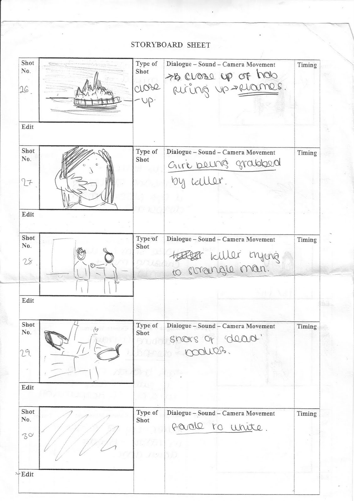
Photo Storyboard
This is our photo storyboard which gives a rough version of how our teaser trailer will unfold. There will be more shots in terms of the montage sequence however i could not take a photograph of all of them as this is just to give a draft of the trailer, the drawn and written storyboards show the shots individually.
1. The first shot will be of the 'ScrudWorks Productions' logo.
2. A black screen will appear and then fade into shot 3.
 3. A medium shot of a front door which is just closing, with the camera zooming in slightly, which connotes that someone has been there. There is diegetic music, creating an eerie effect for the audience.
 A close-up/meduim shot shows a mobile phone. As the shot focuses on the phone, the door can be heard to be closing. The camera will slowly zoom out, with a calling sign on the phone, suggesting that either someone is ringing, or the character has attempted to ring someone.


4. (swap with shot before) Shot focuses on a fireplace, the ringing noise on the mobile can still be heard as the camera then pans around the room.
6. Signs of a struggle is connoted through objects such as chairs being tipped onto the floor...

7. ...along with the curtain blowing in the wind with signs that someone has been in the house. Around the chair are scattered newspapers, and cardboard boxes etc.

8. A close up of a hand shows a watch, with the camera specifically focusing on it and then zooming in. The camera then comes to focus on two bodies lying on the floor, a man and a woman, who look to be dead.
The camera then zooms out from the watch, connoting a flashback in time, with the watch appearing on the wrist of a man. Other various shots show a man and woman - a couple - unwrapping photo frames and boxes. The couple then hear a faint sound (either a knock or a smash of an object) to which a look of panic becomes apparent on their faces.

9. The shot then cuts to a black screen, where the audience hear a woman's voice which whispers ''He's here..'' suggesting they know who or what is coming for them.

10. An extreme close up of the woman's eyes rapidly opening begins the montage sequence of 'flashforwards' - in which time goes quickly showing how they come to be lying on the floor, apparently 'dead'. Loud non-diegetic music begins, almost a face paced pulse sound.

11. A high angle shot shows a woman to be hiding behina a wall, with the legs of the killer being seen, however the viewer doesn't see his face at all through the teaser trailer. The girl is trembling in shock, not knowing that the killer is right at the side of her, behind the wall.

12. A meduim shot of a broken photo frame appears, reiterating a struggle and violence.

13. A hand of the killer is shown to be gripping onto a door, with the girl trying to keep it shut.

14. Quick, rapid shots of a knife appears, with what looks to be blood on it - this reiterates the fact that this is a horror teaser trailer, and coincides with the typical conventions of a slasher trailer.

15. A low angle close up shot - The hand of the killer grabs the girl and prevents her from screaming, connoting shock and ambiguity as to whether she survives.
 ( various other shots are shown between these, such as flames, the man and killer battling each other, the couple running away, the girl being tripped up etc.)

1. The first shot will be of the 'ScrudWorks Productions' logo.
2. A black screen will appear and then fade into shot 3.
3. A medium shot of a front door which is just closing, with the camera zooming in slightly, which connotes that someone has been there. There is diegetic music, creating an eerie effect for the audience. A close-up/meduim shot shows a mobile phone. As the shot focuses on the phone, the door can be heard to be closing. The camera will slowly zoom out, with a calling sign on the phone, suggesting that either someone is ringing, or the character has attempted to ring someone.
5. Meduim shot - into the room, no one can be seen at this point. The camera pans around the room, white noise appears on the tv (this links to the effects in The Ring), suggesting someone has been there. The room is a mess with magazines, newspapers and smashed photo frames scattered everywhere.

4. (swap with shot before) Shot focuses on a fireplace, the ringing noise on the mobile can still be heard as the camera then pans around the room.
6. Signs of a struggle is connoted through objects such as chairs being tipped onto the floor...

7. ...along with the curtain blowing in the wind with signs that someone has been in the house. Around the chair are scattered newspapers, and cardboard boxes etc.

8. A close up of a hand shows a watch, with the camera specifically focusing on it and then zooming in. The camera then comes to focus on two bodies lying on the floor, a man and a woman, who look to be dead.
The camera then zooms out from the watch, connoting a flashback in time, with the watch appearing on the wrist of a man. Other various shots show a man and woman - a couple - unwrapping photo frames and boxes. The couple then hear a faint sound (either a knock or a smash of an object) to which a look of panic becomes apparent on their faces.

9. The shot then cuts to a black screen, where the audience hear a woman's voice which whispers ''He's here..'' suggesting they know who or what is coming for them.

10. An extreme close up of the woman's eyes rapidly opening begins the montage sequence of 'flashforwards' - in which time goes quickly showing how they come to be lying on the floor, apparently 'dead'. Loud non-diegetic music begins, almost a face paced pulse sound.

11. A high angle shot shows a woman to be hiding behina a wall, with the legs of the killer being seen, however the viewer doesn't see his face at all through the teaser trailer. The girl is trembling in shock, not knowing that the killer is right at the side of her, behind the wall.
12. A meduim shot of a broken photo frame appears, reiterating a struggle and violence.

13. A hand of the killer is shown to be gripping onto a door, with the girl trying to keep it shut.

14. Quick, rapid shots of a knife appears, with what looks to be blood on it - this reiterates the fact that this is a horror teaser trailer, and coincides with the typical conventions of a slasher trailer.

15. A low angle close up shot - The hand of the killer grabs the girl and prevents her from screaming, connoting shock and ambiguity as to whether she survives.
 ( various other shots are shown between these, such as flames, the man and killer battling each other, the couple running away, the girl being tripped up etc.)
16. The camera again focuses back on the 'dead' bodies, both lying still with drops of blood and scars on them.
17. The last shot is of a cabinet or draws - with the hand suddenly gripping onto it, it being the hand with the watch on, showing the audience that the man of the couple may not be dead after all.

Idea
Our teaser trailer will begin with our logo of 'ScrudWorks Productions', in which it will then fade to a black screen. The plot begins with various shots of a room which the audience can see has been trashed. A mobile phone will be seen to be ringing continuously. Boxes, magazines, newspapers, lamps, photo frames etc will be strewn across the floor, so it looks like there has been a sign of struggle. Two bodies will be seen on the floor, however it is ambiguous as to whether they are alive or not.A close up on a watch will appear, which will then zoom out showing it to be on the hand of a man carrying a box. He is with a woman which connotes they are a couple however a loud, suspicious noise leads to a black screen with a the words 'He's here' being whispered by either the woman or the man, suggesting that they know who is in their house, with the sinister non diegetic music beginning the montage of shots which will show how the room became messy. The start of the montage of shots will begin with the quick opening of the woman's eyes, as to suggest that of terror and shock. The plot will unfold with a series of shots showing the couple hiding from the killer, who's face is never shown as we want to keep the anonymity to create confusion aswell as terror. Some shots will show how things such as the photo frames and lamps became broken. After the montage, it will then go back to the 'dead' bodies on the floo, with a fade to white then showing the same hand with the watch as before, yet if the audience think they're dead, then the hand suddenly gripping onto something suggests otherwise, which leaves the film open as the ending hasn't been given away in the fact that the couple are dead. Our storyboards go into more detail on ceratin shots etc.


Influences


In terms of influences on our horror teaser trailer, after previously looking at the genre but with a slight twist on it being in the form of parody, films such as The Strangers and The Blair Witch Project are ones which have had slight influences on the way our idea for our trailer has developed. In terms of our previous work on teaser trailers, The Strangers was a trailer which we felt was one that related to how our plot will unfold. This is because the teaser trailer will begin with a slower pace, in order for a scene to be set for the audience. Parts of the story will be given away, but like any teaser trailer, there are ambiguous shots and dialogue, which leaves the audience questioning what is happening. The use of fake 'blood' will be required in order to make it look more of a typical 'slasher' film, and less of a thriller. In terms of The Blair Witch Project, the way in which the story develops links with our idea as the characters in the film are being followed, in which it reaches a deathly climax. The characters in our trailer also are 'followed' or attacked, with certain aspects suggesting that they know the killer, unlike the random murders in The Strangers. However like any teaser trailer, the ending isn't given away, but it leaves it open for the audienc to question what has or will happen.
Wednesday 15 December 2010
Changes
After looking at what we had filmed so far as a group we felt we needed to film certain scenes and shots again to make it look more realistic and professional for the genre we had chosen-Horror. We have done alternate storyboards, keeping some scenes we think worked well the first time, and adding some different shots such as picture montages which can relate to The Strangers teaser trailer. We are debating the name of the film although so far we have come up with;
- Awakened
- Easy Targets
- Chosen Targets
- Presumed Dead
- Breaking and Entering
- Intrusion
We had a few more yet we felt they didn't coincided with the theme of the teaser trailer, and after thinking about the ancillary tasks that we have to create we felt that the name should make it obvious what the teaser trailer is about. The name which we decided to choose was PRESUMED DEAD. This was because it directly linked with the elements of the teaser trailer, where the characters seem dead yet the end shots suggest otherwise.
Magazine covers for films
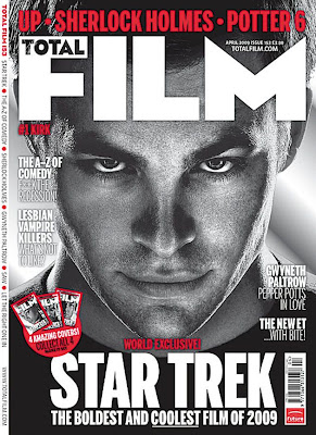
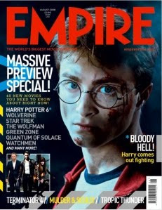
Above are some examples of magazine covers advertising films such as Harry Potter, Star Trek and Sherlock Holmes. Each cover has a shot of the lead actor within the films however they are all shot from different angles which i find particularly interesting
as although there is the recurring theme of a shot of the actors/characters face, the range and angle at which they have been shot present varying effects.
The Star Trek cover shows a close up shot of actor Chris Pine. It appears in black and white which makes his features more defined and his eyes more contrasting with his face, which draws most of the attention. I like the use of black and white as it hints at film noir yet it is portrayed in a modern way with the film name 'Star Trek' appearing in bold capital white letters so the audience can clearly see what is being portrayed. The use of red relates to sin city and their use of colour within the film, with the red, black and white all colours that combine well together to make a bold statement.
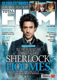
The Sherlock Holmes cover for the same magazine starkly contrasts with the Star Trek one as the colours are more vivid, with the ice blue perhaps representing the characteristics of the actor playing 'Sherlock Holmes'. It is different from the previous magazine cover as although it shows Robert Downey Jr, the shot is more of a medium shot, rather than the close up of Chris Pine's face. I think it has less of an impact than the Star Trek cover as the black and white did place more emphasis on the magazine itself, however the colours of this one coincide with it's release date which was boxing day, as the blue is maybe a reminder of winter or certain themes within the film, represented in the words 'All the elements are coming together' on the front cover. In the background, there is a loose and nearly transparent image of Big Ben and the Houses of Parliament, suggesting that the setting for the film is in London, and 'Sherlock's' outfit conveys the idea that it is set in a previous era. The title of the magazine 'Total Film' has been placed behind Robert Downey Jr, placing more emphasis on him rather than the titles.
Finally, the magazine cover advertising Harry Potter is for a different magazine however it again uses the face of the main character within the actual film and coincides with the idea that there is more focus and emphasis on them in order to sell the film and ultimately the magazine. Daniel Radcliff is shown as his character Harry Potter, and although his face is turned towards the front, his body looks to be moved round to the side, creating a different view from that of the previous magazine covers. The tag line 'Bloody hell, Harry comes out fighting' coincides with the bruised and bloody face that he has, where it looks like his glasses are broken. This relates to the Sherlock Holmes magazine cover, where the colours link to the tag-lines and words written on the cover. Radcliff is surrounded by darkness connoting the idea that the film has become more darker and sinister as they continue. The light/dark contrast on his face suggests the typical good/bad side to the character, shown in a meduim/close up shot. There appears to be more writing on this cover, which does take the focus away from the actor a little, and a range of different colours have been used such as red,blue and yellow, and there doesn't really appear to be a continuing theme. Overall, i think that the Star Trek cover is the most effective, partially because of the black and white that has been used, and i don't think that this would defer its target audience from buying it.
Tuesday 7 December 2010
Typography
 This typography for perhaps either our magazine cover or post probably isn't the best effective font as it doesn't connote that of a horror genre and appears quite plain, and for our ancillary tasks we would want the typography to stand out.
 The font above is quite effective in terms of linking it with the horror genre as it connotes exactly that. I think it is conventional but not a recycled font in the way that typography for horror films or trailers usually are. If we were to pick a font it would probably be this one.
 This font like the font below is perhaps the typical conventional font for a horror teaser trailer as it immediately connotes the horror aspect/elements of a film, however i think because it has been continually used throughout various decades i think it's effect is little in terms of the way the audience can relate to it. For this reason it seems that this wouldn't be a type of font that we would choose to appear on the magazine cover or poster.
 It seems this typography is very similar to the font above in which the conventional blood dripping down from the font is made to make the audience more fearful, however like the font above, it's horror aspect on the audience is varying from little to none.
Subscribe to:
Posts (Atom)