Wednesday 15 December 2010

Changes

After looking at what we had filmed so far as a group we felt we needed to film certain scenes and shots again to make it look more realistic and professional for the genre we had chosen-Horror. We have done alternate storyboards, keeping some scenes we think worked well the first time, and adding some different shots such as picture montages which can relate to The Strangers teaser trailer. We are debating the name of the film although so far we have come up with;
  • Awakened
  • Easy Targets
  • Chosen Targets
  • Presumed Dead
  • Breaking and Entering
  • Intrusion
We had a few more yet we felt they didn't coincided with the theme of the teaser trailer, and after thinking about the ancillary tasks that we have to create we felt that the name should make it obvious what the teaser trailer is about. The name which we decided to choose was PRESUMED DEAD. This was because it directly linked with the elements of the teaser trailer, where the characters seem dead yet the end shots suggest otherwise.

Magazine covers for films


Above are some examples of magazine covers advertising films such as Harry Potter, Star Trek and Sherlock Holmes. Each cover has a shot of the lead actor within the films however they are all shot from different angles which i find particularly interesting
as although there is the recurring theme of a shot of the actors/characters face, the range and angle at which they have been shot present varying effects.
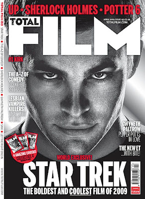
The Star Trek cover shows a close up shot of actor Chris Pine. It appears in black and white which makes his features more defined and his eyes more contrasting with his face, which draws most of the attention. I like the use of black and white as it hints at film noir yet it is portrayed in a modern way with the film name 'Star Trek' appearing in bold capital white letters so the audience can clearly see what is being portrayed. The use of red relates to sin city and their use of colour within the film, with the red, black and white all colours that combine well together to make a bold statement.
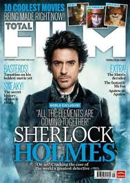
The Sherlock Holmes cover for the same magazine starkly contrasts with the Star Trek one as the colours are more vivid, with the ice blue perhaps representing the characteristics of the actor playing 'Sherlock Holmes'. It is different from the previous magazine cover as although it shows Robert Downey Jr, the shot is more of a medium shot, rather than the close up of Chris Pine's face. I think it has less of an impact than the Star Trek cover as the black and white did place more emphasis on the magazine itself, however the colours of this one coincide with it's release date which was boxing day, as the blue is maybe a reminder of winter or certain themes within the film, represented in the words 'All the elements are coming together' on the front cover. In the background, there is a loose and nearly transparent image of Big Ben and the Houses of Parliament, suggesting that the setting for the film is in London, and 'Sherlock's' outfit conveys the idea that it is set in a previous era. The title of the magazine 'Total Film' has been placed behind Robert Downey Jr, placing more emphasis on him rather than the titles.
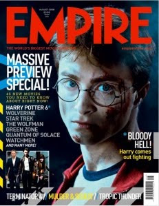
Finally, the magazine cover advertising Harry Potter is for a different magazine however it again uses the face of the main character within the actual film and coincides with the idea that there is more focus and emphasis on them in order to sell the film and ultimately the magazine. Daniel Radcliff is shown as his character Harry Potter, and although his face is turned towards the front, his body looks to be moved round to the side, creating a different view from that of the previous magazine covers. The tag line 'Bloody hell, Harry comes out fighting' coincides with the bruised and bloody face that he has, where it looks like his glasses are broken. This relates to the Sherlock Holmes magazine cover, where the colours link to the tag-lines and words written on the cover. Radcliff is surrounded by darkness connoting the idea that the film has become more darker and sinister as they continue. The light/dark contrast on his face suggests the typical good/bad side to the character, shown in a meduim/close up shot. There appears to be more writing on this cover, which does take the focus away from the actor a little, and a range of different colours have been used such as red,blue and yellow, and there doesn't really appear to be a continuing theme. Overall, i think that the Star Trek cover is the most effective, partially because of the black and white that has been used, and i don't think that this would defer its target audience from buying it.

Tuesday 7 December 2010

Typography

This typography for perhaps either our magazine cover or post probably isn't the best effective font as it doesn't connote that of a horror genre and appears quite plain, and for our ancillary tasks we would want the typography to stand out.

The font above is quite effective in terms of linking it with the horror genre as it connotes exactly that. I think it is conventional but not a recycled font in the way that typography for horror films or trailers usually are. If we were to pick a font it would probably be this one.

This font like the font below is perhaps the typical conventional font for a horror teaser trailer as it immediately connotes the horror aspect/elements of a film, however i think because it has been continually used throughout various decades i think it's effect is little in terms of the way the audience can relate to it. For this reason it seems that this wouldn't be a type of font that we would choose to appear on the magazine cover or poster.


It seems this typography is very similar to the font above in which the conventional blood dripping down from the font is made to make the audience more fearful, however like the font above, it's horror aspect on the audience is varying from little to none.

Film certificate


We have decided that the teaser trailer will be a 15 as it directly links to the ages of our target audience, in the way that the main age for cinema goers is that of 16-24. We didn't want the teaser trailer to be a 12 certificate as this would mean that those viewing it may perhaps be too young, whereas we viewed an 18 certificate as too old and the shots that were incorporated into our teaser trailer weren't disturbing in the way that other teaser trailers for films are such as the multiple Saw films, or The Blair Witch Project. A 15 certificate means the trailer can be viewed by the main cinema goers, making it more accessible which would eventually save on distributing costs.

Scripts for various scenes


These are the scripts for our teaser trailer. Each scene has various different characters in it with a certain amount of dialogue.

Wednesday 1 December 2010

Change to Horror Teaser Trailer

After much deliberation, we have decided to change to doing a horror teaser trailer, instead of a spoof/parody. We have already produced storyboards on our horror teaser trailer, and will be planning to film shortly. After producing the parody trailer, we felt that it wasn't of an A level quality, and our ideas had begun decrease in terms of effects for editing etc as the stoyline wasn't as clear as we intended it to be.
Alot of the previous research i have produced can still be used towards the horror teaser trailer as i have looked at such films as The Strangers, The Paranormal Activity and for our parody we included aspects from The Ring.

target audience


This is our target audience research for our teaser trailer in which we asked a series of questions to a number of people we feel are our specific target audience. The answers given obviously affect the way in which we produce our teaser trailer, as we want our target audience to understand and like our parody trailer.