This typography for perhaps either our magazine cover or post probably isn't the best effective font as it doesn't connote that of a horror genre and appears quite plain, and for our ancillary tasks we would want the typography to stand out.

The font above is quite effective in terms of linking it with the horror genre as it connotes exactly that. I think it is conventional but not a recycled font in the way that typography for horror films or trailers usually are. If we were to pick a font it would probably be this one.
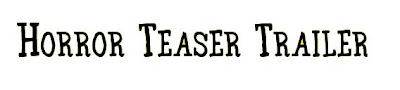
This font like the font below is perhaps the typical conventional font for a horror teaser trailer as it immediately connotes the horror aspect/elements of a film, however i think because it has been continually used throughout various decades i think it's effect is little in terms of the way the audience can relate to it. For this reason it seems that this wouldn't be a type of font that we would choose to appear on the magazine cover or poster.

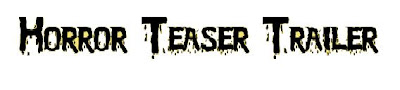
It seems this typography is very similar to the font above in which the conventional blood dripping down from the font is made to make the audience more fearful, however like the font above, it's horror aspect on the audience is varying from little to none.
 This typography for perhaps either our magazine cover or post probably isn't the best effective font as it doesn't connote that of a horror genre and appears quite plain, and for our ancillary tasks we would want the typography to stand out.
 The font above is quite effective in terms of linking it with the horror genre as it connotes exactly that. I think it is conventional but not a recycled font in the way that typography for horror films or trailers usually are. If we were to pick a font it would probably be this one.
 This font like the font below is perhaps the typical conventional font for a horror teaser trailer as it immediately connotes the horror aspect/elements of a film, however i think because it has been continually used throughout various decades i think it's effect is little in terms of the way the audience can relate to it. For this reason it seems that this wouldn't be a type of font that we would choose to appear on the magazine cover or poster.
 It seems this typography is very similar to the font above in which the conventional blood dripping down from the font is made to make the audience more fearful, however like the font above, it's horror aspect on the audience is varying from little to none.
No comments:
Post a Comment