- Awakened
- Easy Targets
- Chosen Targets
- Presumed Dead
- Breaking and Entering
- Intrusion
Wednesday, 15 December 2010
Changes
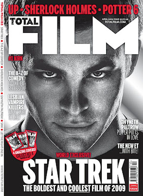
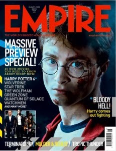
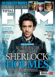
Magazine covers for films
Tuesday, 7 December 2010
Typography
 This typography for perhaps either our magazine cover or post probably isn't the best effective font as it doesn't connote that of a horror genre and appears quite plain, and for our ancillary tasks we would want the typography to stand out.
 The font above is quite effective in terms of linking it with the horror genre as it connotes exactly that. I think it is conventional but not a recycled font in the way that typography for horror films or trailers usually are. If we were to pick a font it would probably be this one.
 This font like the font below is perhaps the typical conventional font for a horror teaser trailer as it immediately connotes the horror aspect/elements of a film, however i think because it has been continually used throughout various decades i think it's effect is little in terms of the way the audience can relate to it. For this reason it seems that this wouldn't be a type of font that we would choose to appear on the magazine cover or poster.
Film certificate

We have decided that the teaser trailer will be a 15 as it directly links to the ages of our target audience, in the way that the main age for cinema goers is that of 16-24. We didn't want the teaser trailer to be a 12 certificate as this would mean that those viewing it may perhaps be too young, whereas we viewed an 18 certificate as too old and the shots that were incorporated into our teaser trailer weren't disturbing in the way that other teaser trailers for films are such as the multiple Saw films, or The Blair Witch Project. A 15 certificate means the trailer can be viewed by the main cinema goers, making it more accessible which would eventually save on distributing costs.
Wednesday, 1 December 2010
Change to Horror Teaser Trailer
Alot of the previous research i have produced can still be used towards the horror teaser trailer as i have looked at such films as The Strangers, The Paranormal Activity and for our parody we included aspects from The Ring.
target audience
This is our target audience research for our teaser trailer in which we asked a series of questions to a number of people we feel are our specific target audience. The answers given obviously affect the way in which we produce our teaser trailer, as we want our target audience to understand and like our parody trailer.
Tuesday, 30 November 2010
zoom practice
This is some camera practice that we filmed for various different techniques on how we will shoot our teaser trailer.
Mock introduction to teaser trailer
This is a mock introduction for our teaser trailer. It is a rough draft of how the opening of our teaser trailer will look.
Monday, 29 November 2010
Parody in Film
More recently, parodies have taken on whole film genres at once. One famous film parody is the Scary Movie franchise. Other notable genre parodies include Not Another Teen Movie, Date Movie, Epic Movie, Meet the Spartans, Disaster Movie, and Vampires Suck.
Thursday, 18 November 2010
Storyboards


These are the storyboards we have created for our horror genre teaser teailer. There are some of the storyboards that have been put into different sections as we are not sure where within the trailer they will go however we are planning to film it and then decide when editing where specific scenes will go.
Thursday, 28 October 2010
Plan for storyboards

Wednesday, 20 October 2010
Audience Research Questions
These are the questions that me and Jack came up with to ask a number of people in order to gain feedback on ideas for our teaser trailer. We are planning to get people to fill in a questionnaire with these questions aswell as create a video which we can then post onto our blog as visual research.
Parody

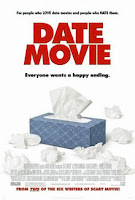
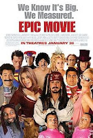

- Epic Movie ( Spoofed Pirates of the Caribbean, Borat and Charlie and the Chocolate Factory)
- Meet the Spartans (Mocked the film 300)
- Date movie (A parody film of many romantic comedy movies)
- Hot Fuzz (Parodied 'Lethal Weapon' and Bad Boys)
- Vampires Suck (2010 - parody of popular teen vampire culture - mocks the Twilight series)
Tuesday, 19 October 2010
Parody of Horror films - Scary Movie
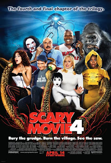
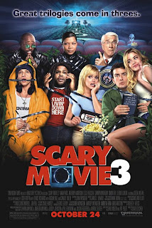

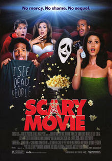
Although this isnt a teaser trailer due to it being more than 2 minutes in length and telling alot of the plot, the Scary Movie films are the modern American dark comdey which parodies the horror, slasher and mystery genres. The tagline is "No mercy. No shame. No sequel.", with the last reference being to the tendency of popular horror movies to become long-running franchises. In 2001 a sequel Scary Movie 2 was released with the tagline "We lied". Later video covers for the first film have the "No" of the "No Sequel" part tagline crossed out. The film was followed by a series of sequels Scary Movie 3 (2003), and Scary Movie 4 (2006). The title comes from the original title of the film Scream.
The films are spoofing popular and current horror/thriller genres of the late 20th and early 21st century,which presumes they are aimed at a younger audience ( who ultimately they are the main cinema goers) and they are relying on this type of audience to understand the jokes and what films they are specifically spoofing. The Scary Movie films are American big budget parodies of various other films that are generally produced on a low budget such as Paranormal Activity and The Blair Witch Project. Throughout the sequals of the movies, some of the same actors appear in disguise as victims of other characters such as the killers or tormentors. <>
Paranormal Activity 2 teaser trailer
This is the teaser trailer for Paranormal Activity 2, a follow on from the 2009 movie of the same name. As a follow on film, the trailer is much shorter than other teaser trailers, as it is only 65 seconds long, perhaps this is because it was such a widely viewed and talked about film that there isnt much need for alot of information or footage in Paranormal Activity 2 as the audience will presumably know what type/ genre of film it is. In terms of horror teaser trailers, this is particularly unique and original in its kind as it is almost a documentory of the events of such characters however it contrasts to the likes of Blair Witch Project as the audience is placed almost as the 'camera's' in which they have a first hand view and potentially know more of what is going on than the characters within the film. As with conventions of other horror teaser trailers, most of the shots are at night using a nightvision camera, which preys on the vulnerability of the audience as darkness creates the illusion of no safety. Although the perpatrators cannot be seen due to them being 'paranormal' i think this produces more fear from the audience as they cannot see the tormentors therefore feel unprotected, something which is useful when trying to gain an audiences attention. As with the previous movie trailer, a woman is shown suggesting she is the typical conventional 'final girl' who survives horrific events within such movies, this also relates to The Strangers, where Liv Tyler is prodominatley shown throughout the trailer, connoting she may be the one who lives to the end, and in The Ring where the blonde Naomi Watts survives the tragic events and murders of those around her, eventually being the final woman alive.
As a parody of Paranormal Activitiy, we would have to think about how we could create the same nightvision shots from a camera, and we would have to consider the mise-en-scene as to create a setting in which the audience can automatically link with the film. In terms of the 'paranormal' aspect, we have thought of mocking such events as the shaking of the camera, the killing of a male character and the use of obvious string to move objects which the audience will be able to see- something which is masked in order to create the enigma within the films.
Horror Teaser Trailers - The Strangers
After deciding to do a paradoy of horror films in our teaser trailer, a film which we would think of spoofing would be the 2008 American Psychological horror and thriller, The Strangers. The film revolves around a young couple who is terrorized by three masked assailants, who break into the remote summer home in which they are staying and damage all means of escape.
This teaser trailer is 1 minute and 15 seconds long which could be said to be quite lengthy for a trailer of this kind. However its contents make the plot knowable yet hold back on who the perpatrators of hassling the two main characters. As an american horror film the trailer seems predictable with the conventional use of black and quick jump shots in which many of the events seem blurred and incomprehensible. The teaser trailer begins with an old fashioned style music with what appears to be old slides of photos with conventional American houses - connoting an almost triviality to the beginning of the trailer, which could initially misguide the audience as to what genre the film is. The music then changes and becomes more sinister with the slide show of photos fading to a completely black screen. Various point of view shots automatically suggest someone or something is watching the main characters, which sets up a dramatic function to the teaser trailer. The main convention that The Strangers is memorable for is the masked terrorizers, who wear white/brown sacks over their heads in order to create an enigma and psychological mystery as to who these people are. As the trailer progresses, a continous scream can be heard as the jump shots conflict one another as if the film has been screened as a slide show of pictures, continuing the nostalgic older era from the start. The rise and fall convention is apparent here as various events in the plot lead to a black screen, and then the main female character trying to escape.
In our group, we have thought about including a parody of The Strangers where we would mock the sacks that the people wear over their heads, perhaps putting funny faces on them in order to create a less psychological thriller type of trailer. We obviously will develope our ideas later in order to create a teaser trailer paraody of horror films.
Monday, 4 October 2010
Prezi
Monday, 27 September 2010
Teaser trailer genre
Friday, 24 September 2010
Brief
Thursday, 23 September 2010
Teaser Trailer Genres

- Romantic Comedy
- Thriller
- Action/Adventure
- Horror
- Comedy
- Sci-Fi
Sunday, 19 September 2010
The Hangover - Magazine cover
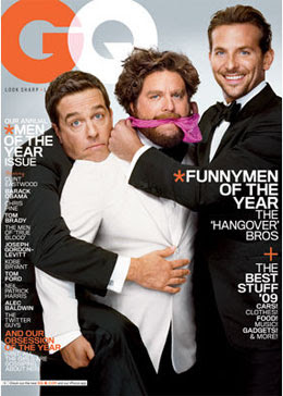
This is a magazine cover for GQ magazine which shows the three main characters of the film The Hangover. The readers gather this as one of the subtitles on the cover says 'The Hangover Bro's' below 'FunnyMen of the year' connoting the genre of the film which the audience will have already recognised from the teaser trailer. The actors look to be as themselves but also in character as one covers a pink cloth around the middle characters mouth and another is hugging him. Each actor has a different facial expresion portraying their individual characters within the film. The men take up most of the front cover of the magazine once again showing their importance and gaining attention for the movie. The orange and white colours scheme for the GQ cover looks smart and professional, coinciding with the outfits the three men are wearing.
The Hangover - Poster
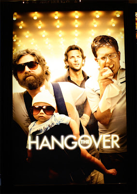
The Hangover - Teaser Trailer
This is the 2009 teaser trailer for the American comedy film that is 'The Hangover'. This film was directed and produced by Todd Phillips.
- The Warner Brothers logo 'Warner Bros Pictures' appears with a light blue sky background, which already suggests that the film won't be that of a thriller or horror, this is gathered when comparing it with the Inception Warner Brothers logo.
- Telephone sound can be heard whilst the logo is on screen, with a female voice.
- 'Legendary Pictures' logo shows with a black background.
- A meduim/close up shot of a male character (Bradley Cooper) on a mobile phone. Looks to be in a desert, in the background is 3 other men and a car.
- Cuts to a Close up of a female who looks to be in a different location - voice that was heard when production logo appeared a the start. Phone call grabs attention from audience.
- Shot reverse shot between man and woman- worried facial expressions.
- Over the shoulder shot of another middle aged man with dark hair - male characters look worse for wear suggesting something has happened.
- Non diegetic zooming sound as shot cuts to a blue and black screen with neon lights showing the words '2 days earlier' . Music picks up - rock and roll sound. The letter 'E' fades away.
- Low camera shot shows one of the male characters seen before, now lying on marble floor.
- Mise en scene shows a wrecked appartment/hotel room.
- A shot reverse shot between another man and a tiger in a bathroom. Ambient lighting shows it is morning time following night before - synergy with film title 'Hangover'.
- Close up shot of man missing a tooth - no recollection of how he lost it.
- High angle shot of a baby crying in closet.
- Low angle shot behind baby shows the 3 men crowding round outside the cupboard confused as to why the baby is there.
- Over the shoulder side shot of a man holding the baby which now has sunglasses on.
- Low angle tilted shot of a valet handing over a police car to the men.
- Outside a large hotel, man hits car door onto the baby -already shows comic elements.
- Black and blue background with same colour neon lighting as before shows title 'From the director of Old School.
- Non diegetic music is now louder.
- Point of view shot from inside boot of car of 2 of the main male characters.
- Night time shot a car crashing into another. Neon lights are seen in background - correlation between that and the movie titles.
- Film title in large, bold letters 'THE HANGOVER' in brighter neon lights than other titles with sparks flying off the edges.
- Music changes to Phil Collins 'In the air tonight' - target audience for adults as well as teenagers.
- Meduim shot of Mike Tyson singing along to music.
- Cuts to him punching one of the characters in the face.
- Low camera shot shakes as man falls to floor.
- Final shot of black and blue background with orange/red neon letters of film release date 'June 5th' and website for the movie appears which shows more information can be given to the audience about the film.
- Fades to black.
Thursday, 16 September 2010
Magazine cover - Leonardo Dicaprio in Inception
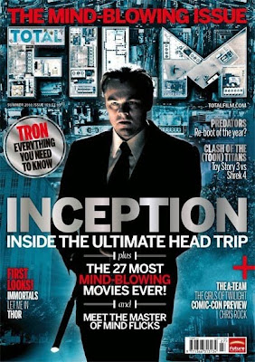
Inception Poster
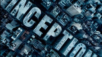
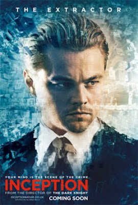
This poster for the film gives more away as Leonardo Dicaprio is the focus of it with a meduim/close up shot of his head and shoulders. He generally looks quite serious which again links back to the teaser trailer where although he doesn't talk at all, his facial expression connote a worried and formal look. The city buildings are again shown in the this poster as with the other ancillary products and in the teaser trailer, yet this time they make the main character look quite pixalated, as if it is almost a painting as the buildings curve round to make an almost global shape. The suit and tie he is wearing portrays his formal and serious character, and the light put on his face contrasted with the dark could suggest multiple personalities or sides to him as a character in the film. The title INCEPTION is shown in a different colour to the metallic grey they are usually produced in,this time with bold blood red to make the title stand out against the background and to catch the audience's eye.
Inception teaser trailer
- A black screen appears with the Warner Brothers company logo on it in a silver metallic colour. This against the black background suggests that the film will contain sinister elements. As the camera zooms in, inside the logo is what looks to be that of a city, with grey block buildings taking the shape of the W and B for Warner Brothers. The colour of the letters is slightly reflective, with an almost metal aesthetic quality to it, giving the impression of something quite emotionless and cold.
- Non diegetic music can be heard as the logo is zoomed in on, it isn't any recognisable music but a sound that is used to build tension from the very start.
- The shot goes to black - continuing the dark and sinister theme.
- What appears to be the directors name 'Christopher Nolan' is shown in the same silver/grey typography as the production/distribution company logo. As with the logo before, the title is zoomed into, until it slowly fades out. The non diegetic music continues, gradually getting louder.
- The black screen fades in to show a metallic spin top , on what appears to be a marble surface. the focus is on the spin top although the reason for this is not clear. off focus colours are in the background, with a contrast between the dark background and the white reflective surface.
- As the spin top spins round, the music coincides really effectively, with the high and low sounds imitating the rotations of the spin top. Towards the end of the shot the spin top slows down.
- The black background is shown again with 'The Director of Dark Knight' in once again the metallic silver typography. The name Christopher Nolan is meant to be applied to this. The typography of the titles is zoomed into, as the music gradually begins to get louder.
- Quite a loud boom sound is heard when an aerial long shot of a city and its buildings appears. After each shot fades the music correlates against the film shot with a higher pitch in the sound thats been used.
- The aerial shot over the city shows cars and forms of transport to be moving along a large road showing aspects of the city as it moves across.
- It then cuts to a medium shot of Leonardo Dicaprio who looks to be inside some sort of helicopter or aeroplane, connoting that the view just seen is from his point of view. The fact the camera focuses on him shows that he will play a main part in the film and the worried expression portrays a turn of events and coincides with the dark theme already shown of the film.
- The shot then sharply cuts to the outside of the helicopter again from Dicaprio's point of view, where a man can be seen being dragged along by two other men, with the landscape of the city buildings in the background, telling the audience they have landed on a building helicopter pad. The shot then fades to black, almost as if Dicaprio is blinking or sleeping, suggesting a dream like end to what has just been witnessed.
- A black screen with 'leonardo Dicaprio' is shown in bold block letters but in the same font as the other credits and same colour.
- It fades to a close up shot of a glass of water on a wooden table, however the water is tilted in the glass which automatically gives the audience the impression that there is something unrealistic/unique going on, making it different to other films. What looks to be artifical light is seen and tension keeps building due to the music becoming louder and more course. The water begins to shake and ripples appear.
- The next shot quickly cuts to a dark street of buildings, which the audience can tell is CGI (computer genereate image) due to the unreal quality it has to it as it contains the same metallic colour that has been seen throughout the trailer, and the cleanliness and emotionlessness of the street supports the theme of the film.
- The words 'Your mind' appear in the centre of the screen infront of the cgi street that we can see.
- The camera starts to tilt as it travels down the street suggesting a lack of direction and creating confusion in some aspects, as do the words.
- The shot fades to black.
- A meduim/close up shot of Leonardo Dicaprio is shown, supporting the fact that he is important to the plot, the nighttime series of shots connote there is no safety and suggests that no one is safe.
- 'Is the scene of the crime' appears and travels down and around the side of a cgi building as it follows on from the previous words, creating a postmodernist edge to the film as what appears to be real actually may not be.
- A low angle shot of two men in what could be seen as a hotel corridor is shown, as there is an elevator in the background and rows of doors on either side. One man adopts a crouching position as another man (perhaps staff off the hotel as what he is wearing looks like a consierge uniform) lunges towards him.
- The camera switches to an over the shoulder shot of the crouching man, where his fate of escaping is left hanging as the camera then cuts to another shot. All the while the music gets louder.
- A meduim close up shot of a man in a suit emerging from under water in a bath tub is shown, the water droplets create an effective look.
- The shot then cuts back to the two men in corridor who have lunged towards each other in what could be considered a 'Matrix' style fighting position as they are in mid air which in reality would be unrealistic and in-attemptable.
- An extreme close up of part of a clock appears as the clock reaches the 12/60 hand.
- The evens in the corridor continue in the matrix style shots although they are sped up and shown by various titled low angle shots.
- A meduim shot of again Leonardo Dicaprio shows him suddenly waking up, suggesting that what we as an audience are seeing is just in his head.
- The camera then travels up a large reflective shiny building and a zoomed out aerial shot shows a maze like area where the film title of 'Inception' appears in black letters. The music has quitened down and the shot draws to a close with a black background with 'Summer 2010' appearing in silver metallic letters.
Wednesday, 15 September 2010
Teaser Trailers
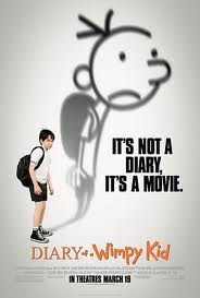
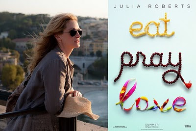
The trailer will genereally show around 30-60 seconds of the film, however, sometimes they contain little or actualy no footage of the film they are advertising, for instance a number of shots can be created just for the purpose of the trailer and aren't actually featured in the film.
They are usually released well in advance before the film comes out either at the cinema or theatre, this is so it can generate a 'buzz' for the target audience.
Teasers are also commonly used in advertising. The so-called teaser ad or teaser campaign typically consists of a series of small, cryptic, challenging advertisements which anticipate a large, full-blown campaign for a product launch or otherwise important event.
Tester trailers are usually only made for big-budget and popularly themed movies. Their purpose is less to tell the audience about a movie's content than simply to let them know that the movie is coming up in the near future, and to add to the hype of the upcoming release. Teaser trailers are often made while the film is still in production or being edited and as a result they may feature scenes or alternate versions of scenes that are not in the finished film. Other ones (notably Pixar films) have scenes made for use in the trailer only. Teaser trailers today are increasingly focused on internet downloading and the convention circuit.
Tuesday, 14 September 2010
Cemetery Junction Poster
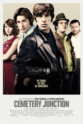 The poster for the film Cemetery Junction shows the five main characters of the film with a plain beige background, something which is effective in keeping the focus on them. The outfits the characters are dressed in here are ones that are shown in the trailer, following a certain continuity which the audience can then associate with the film. Although at first glance the characters seem to be placed equally in rows behind the frontman, at a closer glance they are placed further away, with Ricky Gervais at the back connoting his part in the film won't be a main part, whereas the character that we see in the trailer (left to the young lad at the front) is placed just behind him suggesting he is important to the plot aswell, although having watched the trailer i would have thought he would be placed at the front instead of the tall character in the leather jacket.
 The poster mainly consists of men portraying the male dominated era in which the film was set, however the female which appears in this is holding a superior pose and wearing a red dress which shows her femininity but considering she is the only girl featured it gives the impression that she is important to the plot.
The title of the film 'Cemetery Junction' is in bold capital letters in the same colour font as was used in the trailer, giving a sense of continuity.
The tagline - 'Be young, Be free, Be somebody' again continues on from the trailer where it specifically focuses on individuals and aspects of their life, what type of person they are -whether they are out for fun or a good job. As with the trailer, the 'written and directed by' credits appear just before the title, giving the same authenticity of other films.
Cemetery Junction
This is the international film trailer for the British drama film Cemetery Junction; directed and produced by Ricky Gervais and Stephen Merchant (best known from British sitcom The Office). The film was released 14th April 2010.
- The trailer begins with the image of Columbia pictures, the distribution company for the film. ( as we are planning on producing a trailer we would also have to think about logos for production and distribution company to make it look all the more realistic.)
- A shot of a black background appears and fades out to a girl and a boy who look to be young adults, having a conversation at a bar. The meduim shot focuses on just them even though a bartender can be seen behind them. The male is wearing a black suit and bow tie, with a long hairstyle, where the girl is clothed in a floral pink dress and has a her hair flicked outwards - connoting from the beginning that the film is set in a previous era. Soft non diegetic music is playing in the background.
- Shot to black again.
- Fade in, the camera zooms in on the same two characters speaking, obviously showing a purpose slight jump in time to the conversation.
- Fade to black. White typography appears with the writing 'In Cemetery Junction' on it. All the letters are in capitals suggesting that the film is a bold statement about life in the era that it is set.
- A quick long/medium shot shows what looks to be the Cemetery Junction train station. The scene shows what today would be considered as vintage cars as they uphold the 60's/70's era which the film is trying to portray.
- Medium close-up of two teenagers/young adults - one is tall with dark hair and a red jacket whilst the other is shorter with a trilby hat and glasses.
- The young male (wearing a denim jacket)who was featured at the start of the trailer is shown again connoting that he is an important or even main character to the plot.
- Panning low angle shot of the three boys together. The tallest one is infront with the cigarette and black leather jacket adding a sense of rebellion. A train is moving past them which supports the previous image of the train station.
- A shot then switches to a conversation the three lads are having, suggesting they are friends. The familiar non diegetic continues but is more noticable than before.
- Long/medium shot of a vandalised billboard shows the immaturity but also the nature of the boys and what they do in Cemetery Junction.
- Another black shot appears with 'Some people want success' - following on from the previous words 'In cemetery junction'. A narrative is starting to develope between the words and the shots shown of the characters in the film.
- A long panning low angle shot appears to show the main male character walking outside an executive looking bulidng-contrasting from the countryside area in which he and his friends were in where they graffitied the billboard.
- An over the shoulder shot shows the male in an office, being interviewed, he begins to talk about how he doesn't want to end up like his dad;
- A shot of his dad (Ricky Gervais) puts focus on him from the other men he is working in a factory with so the audience can identify who is being talked about.
- A shot reverse shot shows the 'dad' to be arguing with his mother, the young mans grandma. The conversation shows the cynical comedy that the film entails which gives a good sense of the genre.
- Black screen shows 'some people want a good time' in the same font as the previous sentences.
- Long/meduim shot of tall 'rebellious' character talking to a girl - this portrays what the words have just stated.
- Further shots of the same young lad show him getting into trouble such as fights and punch ups, and an effective technique that is used is that of slow motion which slows down the punch that the lad throws.
- Cuts to a prison where it shows three prison cell door - one for each of the main characters. Being in the local prison doesn't seem to be something of a big deal as the friendly officer isn't surprised to see them there and see's them as lads being lads, connting the era once again.
- A series of jump shots shows the officer opening the cell doors which speeds up the process of enabling the audience to see the characters. There is ambient light however the darkness could suggest the somewhat sinister turn of events in the film.
- Another black screen with the words 'and everyone' - the words follow the on screen narrative of the film without giving too much away, which i think is a great way of illustrating the plot.
- A series of clips show the characters and the setting of cemetery junction, where life seems to be quite laid back and rural almost.
- Black screen - 'wants a way out'.
- A futher series of clips show the characters in the comic scenes - the lads contrasted with old people at what looks to be a party.
- Black screen - 'From Columbia Pictures' - reiterates the distribution company.
- Non diegetic sound can be heard along with talking - louder than before.
- An almost voice over can be heard, with characters talking to each other whilst the plot continues.
- Towards the end of the trailer the directors and writers names of the film are shown - Ricky Gervais and Stephen Merchant. (titles are essential in trailer and we will need to incude them in ours.)
- Further seemingly montage of slow motion shots of the main characters portray them as close friends having a good time - coincides with the slight slow pace of the music.
- Finally the title of the film 'Cemetery Junction' appears.
- Meduim/close up shot of characters in comic scene which appeals once more to the audience as an enticing effect so that they will watch the film.
- 'Coming soon' in same black background as before, with credits in final shot.
Monday, 12 July 2010
Holding up the boards
Sunday, 4 July 2010
vendetta digipak
Saturday, 3 July 2010
Digipak Analysis

Digipak research
Tuesday, 29 June 2010
Poster designs for our music video
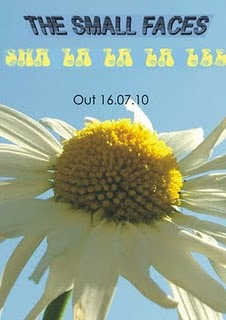 In our group, we decided we wanted our posters to clearly link with our video ideas, so Hannah produced these designs for posters on the Coral Draw programme. They both feature the same image of the daisy, which references to the sixties flower power genre, although the typograhy has been placed and obscured to create different effects. The font for the title of the song 'sha la la la lee' looks to be the same as 60's font that was used furing the time which connotes the hippy style. Out of the two i prefer the poster at the bottom due to the fact that you can see the stem of the daisy although i like the layout of the font on the first poster because it places more emphasis on the music title and it is clear to see.
Typography
 For our music video poster, we have to look for a font that coincides with the sixties style of the video, and i think this one works very well as it looks like the font from the 60's era.
 This font is quite simplistic and i dont think it would make the poster look different from any others but in terms of music poster conventions, simple font is generally used due to the fact it is giving information which is supposed to be clear to understand and read.
 Poster analysis - Florence and the Machine
Poster analysis
