This is our final video
Monday, 12 July 2010
Holding up the boards
Filming this shot was fairly difficult because obviously the boards needed to be held up in time. We practised a few times without the music just to get the actors familiar with what they ahd to to, and then used Lewis' iPhone to play the music which aided the boards to be held up in time. We managed to film a couple of good shots that were in time and we were pleased with that.
Sunday, 4 July 2010
vendetta digipak
This is another example of a digipak with the images portraying clearly that the music is of a death metal genre. The layout is alot like the other digipaks i have researched which is something again we would further research as a group for our own music digipak.
Saturday, 3 July 2010
Digipak Analysis

This digipak is for the band british band Oasis. It is of the same type of layout as the other digipak i have researched, with a few alterations on where the actual CD has been placed. The colour scheme and the image of the guitar very much coincide with the genre of music that Oasis play, and i like how you can't see the whole image of the guitar from the low angle which it has been taken. The size of the typography of 'Oasis' is quite small in comparison with the CD cover yet because they are such a well known and popular band, i don't think this would have any impact on the sales or consumption of this product. The conventional way that the song titles have been placed on the back are familiar with that of traditional CD cases, an issue we will have to think about when it comes to producing our own digipak. The same colours run throughout which again add to the effect and aesthetic quality.
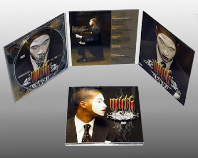
Digipak research

This is an example of a CD digipak, something which we ourselves will have to create along with our music video and poster. I like the layout of this digipak as it appears simple in terms of the way it folds together, and the quality of the images are of a high standard also. The theme of what is on the CD is recurring as the same typography for the title is used on various sides of the didgipak and the same image of what looks like the artist. A different image is used to show the names of the songs for the single/album with some writing placed along side the artist. The way that he is portrayed through separate poses creates a higher aesthetic quality making it look more expensive.
Subscribe to:
Comments (Atom)